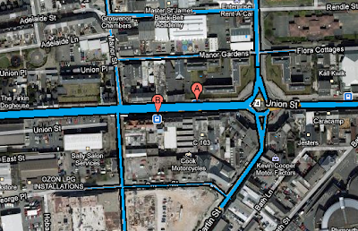
1. start (entering town)
2. island (new group)
3. edge of town (towards starbucks)
4. center (new group) (towards market)
5. bottom (new group) ... pub [MARKET]
6. center (new group) (towards claire's)
7. drakes (new group) ... pub (food & drink)
8. walkway (towards university)
9. home (university) [END]
The colour fade in the center of the fields represent the business sector popularity via the amount of people in the groups.
To extract the KML data is difficult as google does not load up the individual KML files if you upload them onto the system, however, if your phone is licenced or signed up (which the tutors was) you can grab all this information a lot faster and more precise. Luckily, I managed to load up the route and track the places we went, I then added a little graphical interface to show the user where the people was, how many people were there and how many different groups of people there was. Each group is represented by a colour and the lines in the colours show how many people were there. We left and it was one, turned into 2 at the roundabout and then 3 in the middle of town by claires accessories and starbucks then shrunk into 2's and a single to return to the university with. Also at number 5 is the market where shoppers like to grab a bargain, this is where we found the highest amount of people walk to before/after they have visited the town for food or shopping of some sort, everybody likes to grab a bargain!
Average time: 45 mins.
Average time: 45 mins.
Doing this exercise has helped me to understand the social and business importance and usage in the area, it hasaided me in understanding what the most popular places ( for girls) in the town are and why this might be (the pubs locations may have had something to do with it), I would of liked to create a more throrough research into the area but due to the nature of the project and the route that we have already traced i dont believe that the outcome will be much different to the one that I have currently got. We did not ask the girls where they were going or why therefore my outcome is a prediction and may not be fully reliable but overall i am pleased with the learning outcome and i have learnt a lot from the exercise.
Below is a representation of the popular things (companys, schools, recreation) around the area we walked with line representations similar to the one at the beginning of the post but the lines represent how many people we was following at the time, this view makes it a look more easier to see and gives a real view of the area so you can imagine the usage and look of the area.
click to enlarge
Below is a picture of the automotive activity around the theatre and also around stonehouse, the main road seems to be union street as there was streams of traffic along this road and at its intersections, a few cars turned off down its sideroads and either continued down the road or turned to enter onto a different road off union street, possibly to miss traffic.
If the line is thick that means that there was a high amount of automotive activity, if it is low it means that there was minimal. Once again I have used a realistic areal view but I have left the companys names and street names on so that it can be referenced if need be.


